


WB Digital Base 2 Watch Face
4.222.00 Reviews
App Specs
- Version
- Varies with Device
- Updated On
- License
- $2.99
- Downloads
- 10,000+
- Developer
- WatchBase Aura
- Categories
- Personalization
- Platform
- Android
Screenshots
 Analysis by AppCompare
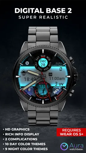
I like a watch face that knows exactly what it wants to be. WB Digital Base 2 Watch Face is not trying to imitate a traditional dial or disappear into the background. It turns a compatible Wear OS watch into a bright digital display with a futuristic, LED-inspired look and a selection of color themes. After spending time with it, my view is straightforward: this is a strong personalization choice for someone who wants the watch on their wrist to feel more like a visible accessory than a quiet utility.
The appeal is immediate, but it is also quite specific. The design depends on glowing visual effects, so it looks best when you enjoy a bold digital style. If you prefer a restrained face with tiny text, muted colors, or a classic analog appearance, this will probably feel excessive rather than exciting. I would describe it as a paid customization app for people who want their smartwatch to make a visual statement every time they check it.
How the face feels in everyday use
I judge a watch face by more than its preview: I want to know whether its look stays comfortable through ordinary routines and whether I can read it with a quick glance. Here, the glowing digital style makes the display feel like a deliberate accessory, so I’d try it with my usual strap and in both bright and dim settings before settling on a theme. That everyday test also helps clarify when another kind of face might suit me better.
A digital personality rather than a neutral display
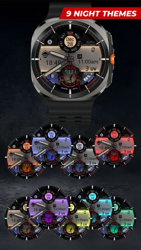
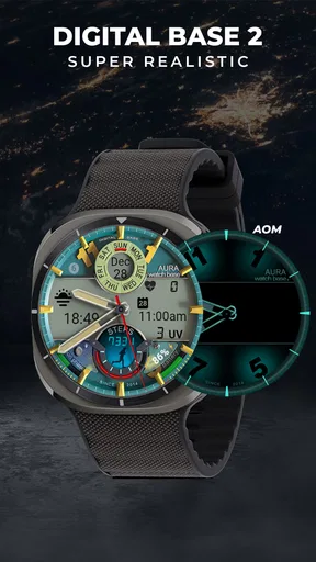
The first thing I noticed is how much the lighting treatment changes the character of the watch. The numbers are not presented as plain text on an empty background; the glowing treatment gives the face a more deliberate, almost instrument-panel feel. That makes a quick glance satisfying, especially in a darker room or during an evening walk when a bright digital layout is easier to notice than a subdued design.
That visual approach also means the face can dominate the watch. On a bright screen, the glow becomes the main event, while the rest of the watch hardware feels secondary. I see that as a strength for users who bought a smartwatch partly for its appearance, but it is a weakness for anyone who wants the screen to stay visually quiet during meetings, reading, or formal occasions.
WB Digital Base 2 comes from WatchBase Aura, and its focus is clear: personalization through a hyper-realistic digital presentation, LED-like effects, and multiple color themes. I would not install it expecting a broad productivity dashboard or a replacement for a health-focused watch interface. Its job is to change the mood and identity of the display, and it stays focused on that job.
Why the color themes matter more than they first appear
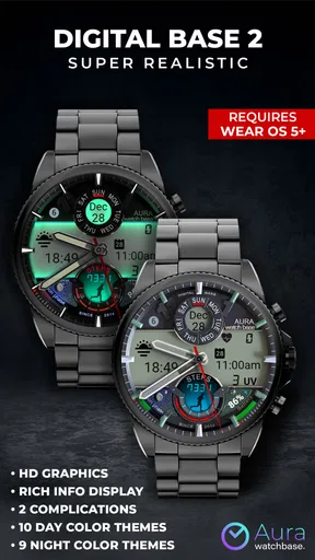
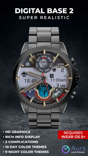
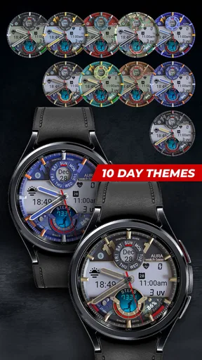
The color choices are not just decorative switches. They let the same layout fit different parts of a day. A vivid tone can work well when I want the watch to stand out, while a calmer theme is easier to live with when the display is checked repeatedly over several hours. This makes the face more flexible than a single fixed neon design, even though the overall style remains unmistakably digital.
Worth Reading Before You Choose

EA SPORTS FC Mobile 26 Is a Bigger Football Game, but It Takes Time

Flipboard Shows What News Apps Must Do Beyond the Feed

Switching to Android Auto Means Rethinking Your Driving Routine

Google Calendar Makes a Crowded Week Easier to Manage

Ludo King Makes the Most of the Minutes Between Plans

Baby Panda World Brings Quick Play to Modern Phones, but Its Game Library Feels Busy
My practical advice is to choose the theme according to the watch body and strap, not only according to personal favorite color. A bright face paired with an already colorful strap can look busy, while a strong accent on a darker watch can create a much cleaner result. I also found that the best choice depends on the environment: a theme that looks impressive indoors may feel too intense outdoors, where reflections and sunlight already compete with the display.
One useful way to approach the options is to treat them as separate moods rather than as minor variations. Pick one for daily wear, another for evenings, and keep a less aggressive option for work or appointments. That small habit makes the purchase feel more worthwhile because the app becomes something I adjust with context instead of something I configure once and forget.
The glance test is more important than the promotional look
Watch faces are often judged from a polished preview, but the real test is a one-second glance while moving. With this design, I would pay attention to whether the luminous styling helps you recognize the time quickly or makes the screen feel crowded. The strong contrast can be helpful, yet visual effects can also compete with the information you actually came to see.
For me, the face works best when the watch is used mainly for checking the time and enjoying the design. It is less convincing if I expect the display to behave like a compact control center for many different tasks. That distinction is important before paying for it: the value comes from the presentation, not from turning a basic watch screen into a complete information hub.
What the paid model changes in the decision
The app costs $2.99, so I would not treat it as an impulse download in the same way as a free wallpaper or a trial customization. The price is reasonable for a face you genuinely enjoy wearing, but the decision depends on how often you change watch faces. If you switch styles every few days, a single paid design may have less lasting value than a broader collection. If you keep one look for weeks, the purchase is easier to justify.
The app is marked for Everyone, which makes it approachable from an age-rating perspective. That does not mean the style will suit everyone visually. The important question is taste: do you want a glowing digital face with a noticeable personality, or do you want your watch to blend into the background?
Where it stands against ordinary alternatives
Compared with the standard watch faces that come with a Wear OS device, this one offers a more intentional visual identity. Built-in options are usually the safer choice when you want a balanced, familiar layout that matches the rest of the system. WB Digital Base 2 is the better pick when those defaults feel too plain and you want the display itself to be part of your outfit.
It also differs from minimalist third-party faces. Minimal designs usually win when legibility and low visual distraction are the priority. This face wins when atmosphere, glow, and color are more important. I would choose the minimalist alternative for a long workday and this one for casual use, evening plans, or any situation where I want the watch to look deliberately customized.
Against a large face collection, the trade-off is variety. A collection can give you several unrelated styles for different situations, while this app concentrates on one recognizable concept. That concentration is not a flaw by itself; in fact, it can make the design feel more coherent. But users who want analog dials, fitness-heavy layouts, or seasonal designs will probably get more flexibility elsewhere.
Small workflow choices that improve the experience
I recommend setting it up when you have time to look at the face on your actual wrist rather than judging it only on the phone’s preview. Wrist angle, room lighting, strap color, and the brightness of the watch display all affect how the glow feels. A theme that seems perfect in a static preview may be too forceful once you are wearing it during the day.
Another useful habit is to give the face a short trial during your normal routine before deciding whether it should become your default. Check it while walking, at a desk, and in a dim room. Those situations reveal different strengths: the digital structure can be easy to recognize at a glance, while the luminous styling may become tiring if it constantly pulls attention toward the screen.
I would also avoid changing themes every time the watch feels slightly repetitive. Instead, keep a preferred everyday color and reserve the more dramatic options for occasions when you want a visible change. This makes the customization feel purposeful and helps you judge whether the face has genuine staying power rather than just an attractive first impression.
A realistic everyday scenario
Imagine starting a normal day with a dark strap and a neutral outfit, then heading to work with the watch set to a calmer color theme. The display remains distinctive, but it does not compete with everything else you are wearing. Later, before meeting friends, you switch to a brighter theme. The watch immediately feels less like a default device and more like a small accessory chosen for the occasion.
That scenario is where I think the app makes the most sense. It gives a familiar piece of hardware a quick visual reset without requiring a new strap or a new watch. The change is small, but it is noticeable every time the screen wakes. For someone who enjoys coordinating personal devices with clothing or mood, that repeated interaction can be more satisfying than the technical simplicity of the app suggests.
The meaningful limitations to consider
The biggest limitation is the narrowness of the concept. A glowing digital face cannot become a classic dial just because it offers several themes. If you eventually want a more understated appearance, you will need another watch face rather than expecting this one to cover every situation.
The visual intensity may also be tiring for some people. Bright effects are enjoyable in short checks, but a design that constantly catches the eye can feel distracting during focused work. I would be cautious about choosing it as the only face on a watch that you use for long stretches of concentration.
There is also a practical trade-off between style and information density. A face built around a strong central digital presentation has to protect that visual clarity, so it may not satisfy someone who wants every possible detail visible at once. If your main reason for wearing a smartwatch is to monitor several pieces of information without opening apps, compare the layout carefully with a data-first alternative before buying.
These limits do not make the app poor; they define its audience. I prefer a face with a clear identity over one that tries to serve every purpose badly. The important thing is to buy it for the design experience, not because you expect it to replace a highly configurable utility face.
Who should choose it
I think WB Digital Base 2 is a good match for Wear OS owners who enjoy futuristic styling, luminous interfaces, and visible customization. It is especially appealing if the standard faces on your watch feel dull and you want a quick way to make the device look more personal. The multiple color themes give the concept enough flexibility to remain useful beyond the first day.
It is also a sensible choice for someone who likes digital watches but wants a more polished, modern presentation than a plain numerical display. The LED-inspired glow adds character without requiring the user to learn a complicated system. In my experience, the strongest reason to install it is simple: you like looking at this kind of display and want to see it every time you check the time.
I would skip it if your priority is a quiet screen, a traditional watch appearance, or the maximum amount of glanceable information. I would also think twice if you rarely keep one watch face for long, because the $2.99 purchase has more value when the design becomes part of your regular routine rather than a brief experiment.
What the public response suggests
The app has an average rating of 4.2 from around 424 ratings, with roughly 22 written reviews and over 10K installs. Those figures suggest that it has found a real audience, while also reminding me not to treat it as a universally loved style. A watch face is unusually personal: two people can look at the same glow effect and reach completely different conclusions.
I would read the rating as evidence that the core idea works for many users, not as proof that it will suit every wrist. The design is distinctive enough that personal taste matters more than a score. If you already enjoy bright digital interfaces, the rating supports giving it serious consideration. If you normally choose restrained faces, your own preferences are more important than the average.
My final recommendation
After using it, I see WB Digital Base 2 as a focused personalization app with a clear thesis: make the Wear OS display look like a glowing digital instrument. It succeeds because it commits to that idea instead of diluting it with an unrelated visual style. The color themes add useful variation, and the face can give an otherwise ordinary watch a stronger sense of identity.
Its weakness is the same thing that makes it memorable. The glow can be too prominent, the style is not formal or minimalist, and users seeking a dense information layout may find a more functional alternative better. I would not recommend it as a universal replacement for every watch face. I would recommend it to someone who wants one expressive, futuristic option that is easy to recognize and enjoyable to wear.
My verdict: choose it for personality, not for maximum utility. If that is what you want from your smartwatch, the focused design and theme changes make the price feel fair. If you want the screen to stay discreet or carry a large amount of information, keep looking; another category of watch face will serve you better.
Pros
- Clean digital layout makes the time easy to read at a glance.
- Offers useful information without overwhelming the watch screen.
- Designed specifically for Wear OS smartwatches.
- Minimal style works well with casual and professional watch bands.
- Usually consumes fewer resources than animated watch faces.
Cons
- Limited appeal if you prefer analog or highly decorative watch faces.
- Compatibility may vary between Wear OS devices and screen sizes.
- Some customization options may require the companion app or settings menu.
- Small text elements can be difficult to read on compact watch displays.
- Battery usage may increase when always-on display features are enabled.
FAQs for WB Digital Base 2 Watch Face
What is WB Digital Base 2 Watch Face?
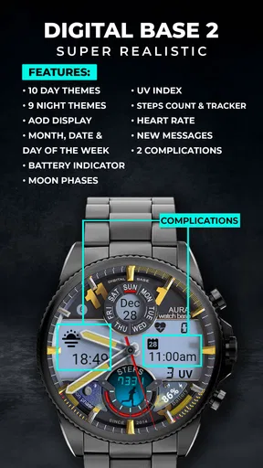
WB Digital Base 2 Watch Face is a customizable digital watch face designed for compatible Wear OS smartwatches. It focuses on a clean, information-rich layout that can display the time, date, battery status, and other watch data at a glance. Its usefulness depends on your smartwatch model, Wear OS version, and the customization options supported by the installation package.
Which smartwatches are compatible with WB Digital Base 2 Watch Face?
Compatibility should be checked before downloading because watch faces are not supported by every smartwatch platform. WB Digital Base 2 Watch Face is intended for compatible Wear OS devices, while Apple Watch, older proprietary systems, and many fitness bands may not support it. Confirm the listed device requirements in Google Play and make sure your watch runs a supported Wear OS version.
Can I customize the appearance and information shown on the watch face?
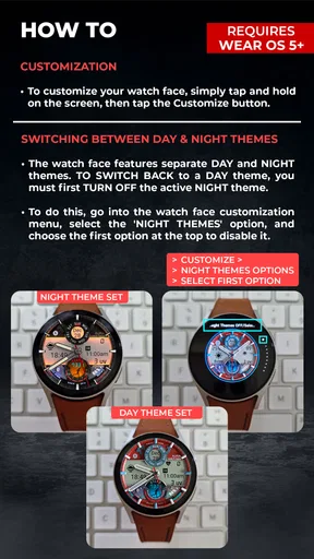
The available customization depends on the version of WB Digital Base 2 Watch Face and the capabilities of your smartwatch. Typically, users may be able to adjust colors, complications, or displayed information such as weather, steps, battery, and date. Some options can require a companion app or may vary between devices, so review the settings after installation to see what your model supports.
How do I install WB Digital Base 2 Watch Face on my smartwatch?
Install the watch face through the official Google Play listing or the supported Wear OS installation method associated with your account. After installation, open the watch-face selector on your smartwatch and choose WB Digital Base 2 Watch Face. If it does not appear immediately, check that the watch is connected, synchronized with your phone, and using the same Google account during installation.
Does WB Digital Base 2 Watch Face affect battery life or require special permissions?
Like any active watch face, WB Digital Base 2 Watch Face may use some additional battery, especially when it updates weather, fitness information, or other live complications frequently. Battery impact is usually influenced more by the selected features and screen settings than by the design alone. Review the permissions requested during setup and grant only those needed for the complications you plan to use.


